Gardner Foundation 2026 IMCA Monte Carlo
« See all cars See Design Tips ⇓ Get this wrap layout »

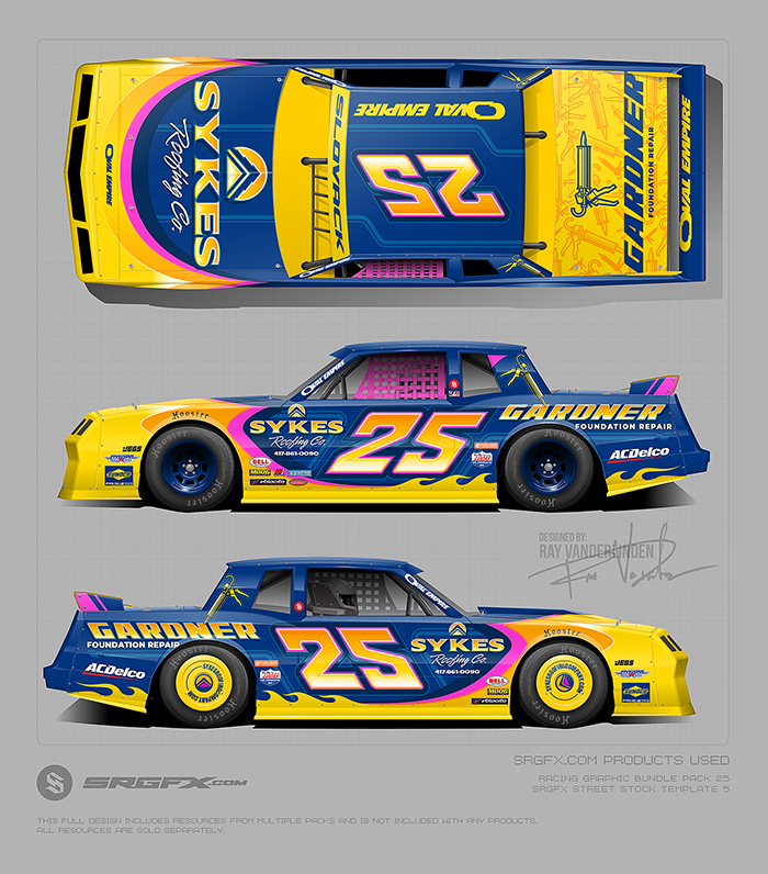
This IMCA Monte Carlo features a bold, high-contrast blue and yellow wrap designed for maximum visibility and sponsor clarity. The layout emphasizes strong color separation, clean number placement, and solid background fields to ensure the car reads clearly at speed while maintaining a modern, aggressive race-ready look.
 Design Tip #1 – Rule of thirds
When using a high-energy color like yellow, let it lead the design — not dominate it. Pairing it with a calmer base color allows the rule of thirds to do the heavy lifting.
Our eyes naturally prefer clear lines of division. Just like trim in a home separates the wall from the floor, color separation on a race car helps organize information and create visual clarity.
In this wrap, the color balance is intentional: about one-third yellow and two-thirds blue, with hot pink used only as an accent. Yellow grabs attention, blue stabilizes the design, and the accents energize everything without overwhelming it.
That balance is the rule of thirds applied to color.
Design Tip #2 – Place Critical Info on a Solid Color Field
The car number and key sponsors sit on a solid blue background, and that’s intentional. Solid fields reduce visual noise, which makes text and logos easier to read at high speeds. Of coarse there are other ways to achieve this even with a busy design unlike this one.
This is a best practice in all signage — billboards, road signs, storefronts — because contrast and simplicity improve legibility. When numbers and logos aren’t fighting patterns, gradients, or color shifts, they register instantly and stick longer.
On a race car, clarity is branding.
School of Racing Graphics Product Quick Links:
- Street Stock 5 Template Monte Carlo Likeness
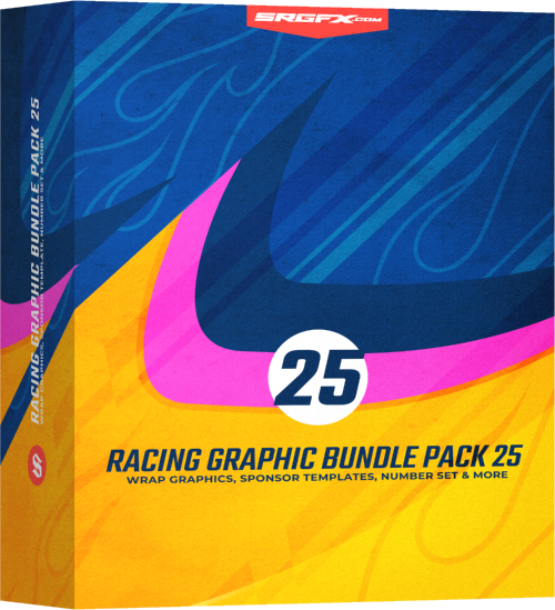
- SRGFX Bundle Racing Graphic Pack 25
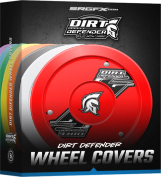
- SRGFX Dirt Defender Wheel Covers
