

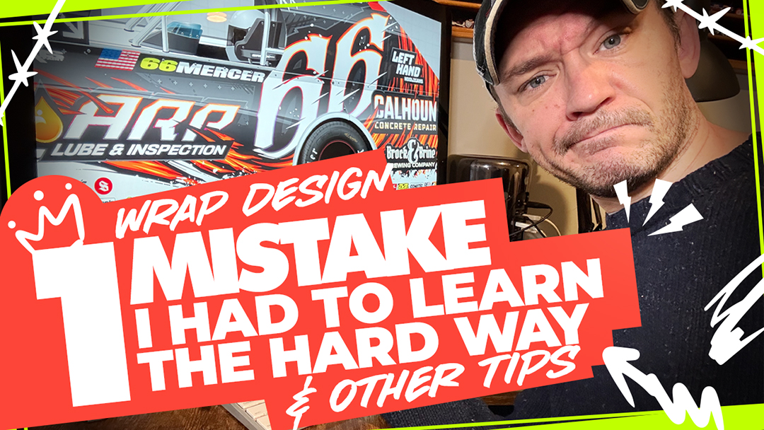
In this video, I break down a newer UMP Dirt Modified race wrap design and walk through how to make a busy, aggressive layout still feel readable and intentional. I talk through number placement, sponsor integration, solid color fields, brand familiarity, and the one design mistake that can quietly wreck legibility on a noisy wrap. If you want to skip to avoiding the big MISTAKE go to 21:15 Time Stamp
If you design wraps that are more full, layered, and high-energy, this one will help you make them work without turning the whole car into visual soup.
Timestamps
0:00 Intro — breaking down a newer busy wrap design
0:40 Why this type of design is polarizing
1:44 Oversized number placement and breaking design “rules” on purpose
2:19 Why brand familiarity matters as much as readability
3:05 Advice for drivers: consistent wraps help build team branding
4:33 The promise: the one secret to making busy wraps still readable
5:12 Why designers need more than one style in their toolbox
7:38 The psychology behind this graphic and why both sides are different
8:39 Starting the layout: big number first, then building the graphic around it
9:32 Creating flow with the main orange graphic
10:18 Why sponsors should integrate with the design instead of looking pasted on
11:35 Adding motion and aggression to the number without hurting readability
12:22 Using interlocking graphic shapes to tie sponsors into the layout
13:21 Resolving graphics naturally into the white body panels with grunge
14:40 Zoomed-out test: what still stands out from a distance
15:17 Why the right side uses a different number treatment
16:14 Solid color fields and how they make numbers stand off the car
17:47 Sponsor priority, readability, and outline strategy
19:50 Best practice for designing busy/noisy wraps
20:35 Always place numbers and sponsors first, then make the wrap work around them
21:15 Big design mistake: using your brightest/readability color inside the background graphic
22:00 Why adding white into the graphic muddies the whole design
23:01 Why a white outline doesn’t automatically “make it pop”
25:25 A better alternative: subtle contrast and controlled outlining
26:59 The core rule for noisy wraps: don’t compete with your own readable elements
27:48 Final takeaway and closing thoughts
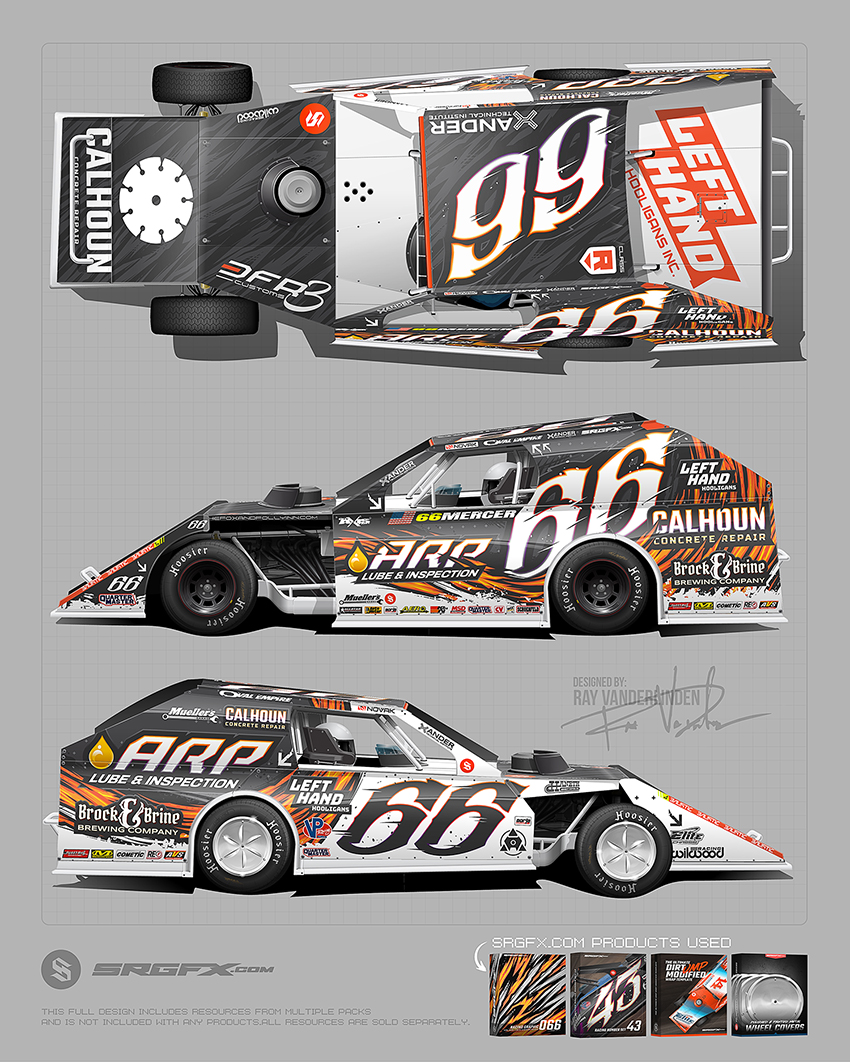
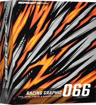
SRGFX Racing Graphic 066 »
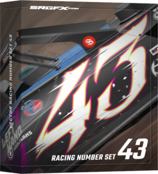
SRGFX Racing Number Set 43 »
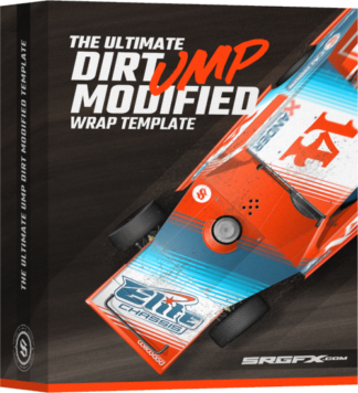
SRGFX Ultimate UMP Dirt Modified Template »
SRGFX Metal Polished Wheel Covers »