TackleBox Riverside Grill 2023 Dirt Late Model
« See all cars See Design Tips ⇓
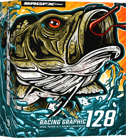
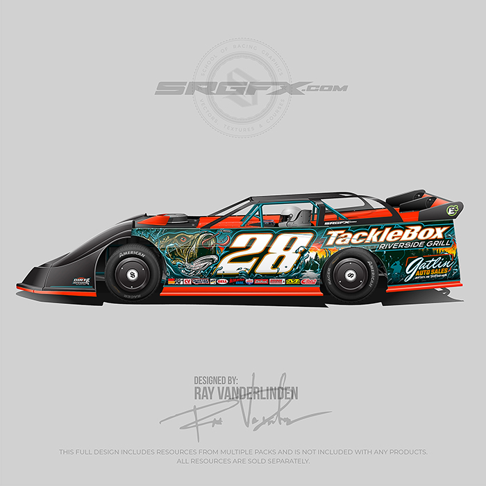
A black, orange and teal number 28 bass fishing Dirt Late Model racing graphic wrap layout. All digital resources and layout for this racing wrap design are available at schoolofracinggraphics.com.
🎣 Design Tip# 1 Handling Congested Background Graphics
This design is loaded — you’ve got the bass, the fisherman, the horizon, the splash… there’s a whole story happening in the background. And that’s great — as long as your story doesn’t overpower the message.
🔑 The key to managing a congested design is contrast and visual hierarchy.
In this layout, the bass artwork is awesome, but it’s not the priority. The number and sponsor information come first, and they stand out clearly because they’re set in high contrast against the darker tones of the artwork. The background elements still shine, but they take the supporting role instead of competing for attention.
When designing wraps with themes, characters, scenery, or a ton of visual elements, remember this rule: The background can have personality — but the message must have dominance. If your text disappears into the chaos, the design fails no matter how cool the artwork is. White numbers and sponsor logos on dark graphics immediately establish hierarchy, making sure the viewer sees:
-Who the driver is
-Who paid to be seen
-Then the story behind it
That balance is what makes a wrap both functional and memorable.
🎨 Design Tip# 2 Blending colors into deep contrast
Notice the detail in the number and sponsor text. Instead of using plain white lettering with a single outline, I worked the brand colors into the strokes to tie everything together. But here’s the catch:
You can’t just stack colors in random order. Placement matters.
If I went white → teal → yellow-orange → teal again, the eye wouldn’t know where to focus. You’d create multiple contrast points, which makes the text harder to read and breaks visual flow. Your goal is one clear point of contrast. Everything else should support it.
In this design, the core text is white—that’s the hero. Next, I added a very thin orange-yellow stroke, placed on the inside edge of the letter. That keeps the crisp outer edge of the number clean and prevents the character shapes from getting bulky or muddy. If that thin stroke were on the outside, it would widen the formatting, fill gaps, and start closing negative space—making the text harder to read from a distance. After that subtle stroke, I added a thick deep teal outline. That’s where the real contrast happens. It separates the text from the background and makes it pop without fighting the artwork behind it.
Finally, I added a lighter turquoise accent, which I don’t normally do. But in this case, it reinforces the water theme and creates a visual connection across the entire wrap—so the color system is unified, not random.
🔑 The takeaway: Color layering isn’t decoration—it’s structure. Build your outlines intentionally so the viewer reads the message instantly, while still experiencing the theme behind it.
