McKabe Auto body 2025 Crown Victoria
« See all cars See Design Tips ⇓ Get this wrap layout »
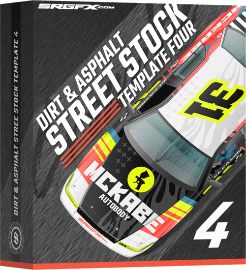
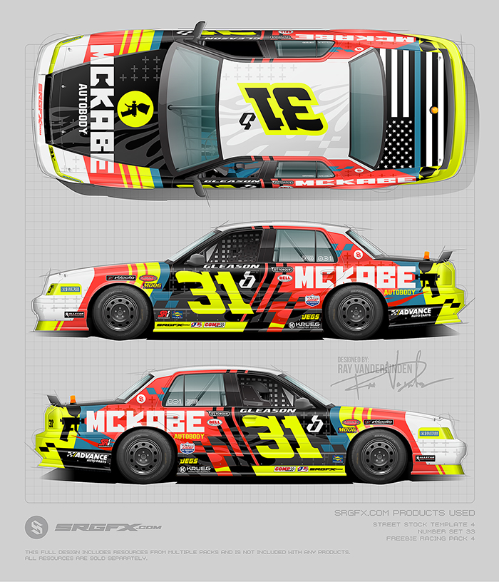
This dynamic Crown Vic wrap idea bursts with energy, combining bold blocks of fluorescent yellow and vivid scarlet red with crisp black and white accents to deliver maximum visual impact. The large “31” race number is bright fluorescent yellow and front-and-center on the roof and doors, while the striking silhouette logo of McKabe Autobody anchors the hood and rear quarter-panel with confident branding. Sharp diagonal racing stripes, an American-flag motif on the deck-lid, and sponsor decals blended seamlessly into the composition complete the high-octane, professional look.
Design Tip #1 – Gestalt’s Law of Continuation & Directional Flow
Notice how the main red stripe slants to the rear from the door and slices after the number but creates a clean canvas for the sponsor to land on. That’s not just flash — it’s a visual cue that carries the viewer’s eye in the same direction that the car moves. It builds momentum and visual hierarchy through line work, think about continuation as your invisible motion blur — the brain feels speed even before the car moves.
Design Tip #2 – Figure–Ground Contrast & Alignment for Readability
The high-contrast flo-yellow number bordered by deep black instantly locks in focus. That’s “figure–ground” separation working hand in hand with contrast. The number becomes the most prominent piece of the design. When you’re designing, test your number and sponsor area in grayscale — if it still reads instantly, you’ve nailed the hierarchy. Everything else should support that clarity, not compete with it.
Design Tip #3 – Color Proportion & Rhythmic Balance (60–30–10 Rule)
Most of this wrap breathes in red and black. Though they are very different visually they share a similar saturation value— that’s your 60%. Grayscale your work for validation on 60-30-10 rules. The black base gives the design visual gravity, and the flow yellow accents light it up with controlled energy. The temptation is always to push the accent (flo yellow) harder, but restraint makes impact. Keep your 10% (flo yellow in this instance) hot and deliberate — like punctuation on the end of a sentence. In other words, don’t overkill a good thing.
School of Racing Graphics Product Quick Links:
- Street Stock 4 Template Crown Vic Likeness
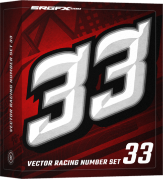
- SRGFX Racing Number Set 33
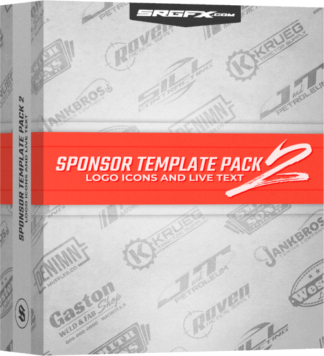
- SRGFX Sponsor Template Pack 2
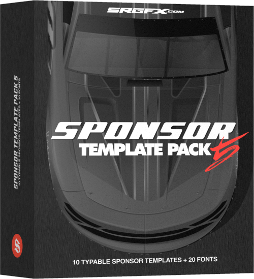
- SRGFX Sponsor Template Pack 5
